Project type: Branding / Industry: Pharmaceutical B2C
Home Pharmacy of California rebrand

An effective rebrand can help raise the perception of value in the eyes of not only customers, but also lucrative investors. Home Pharmacy of California was bought out by Walgreens just a few years after this rebrand was completed.


Project objectives
Home Pharmacy of California brought pharmaceuticals and medical equipment to the patient’s doorstep. Their new logo had to express a challenging mix of “friendly care” vs. “sensitivity for the bottom line.” The organizations they served had very differing focuses, such as nonprofit care-taking organizations vs. managed care insurance companies. Thus, expressing the efficiency of their services, as well as the personal touch that they provided in their day to day activities was key in creating this new mark.
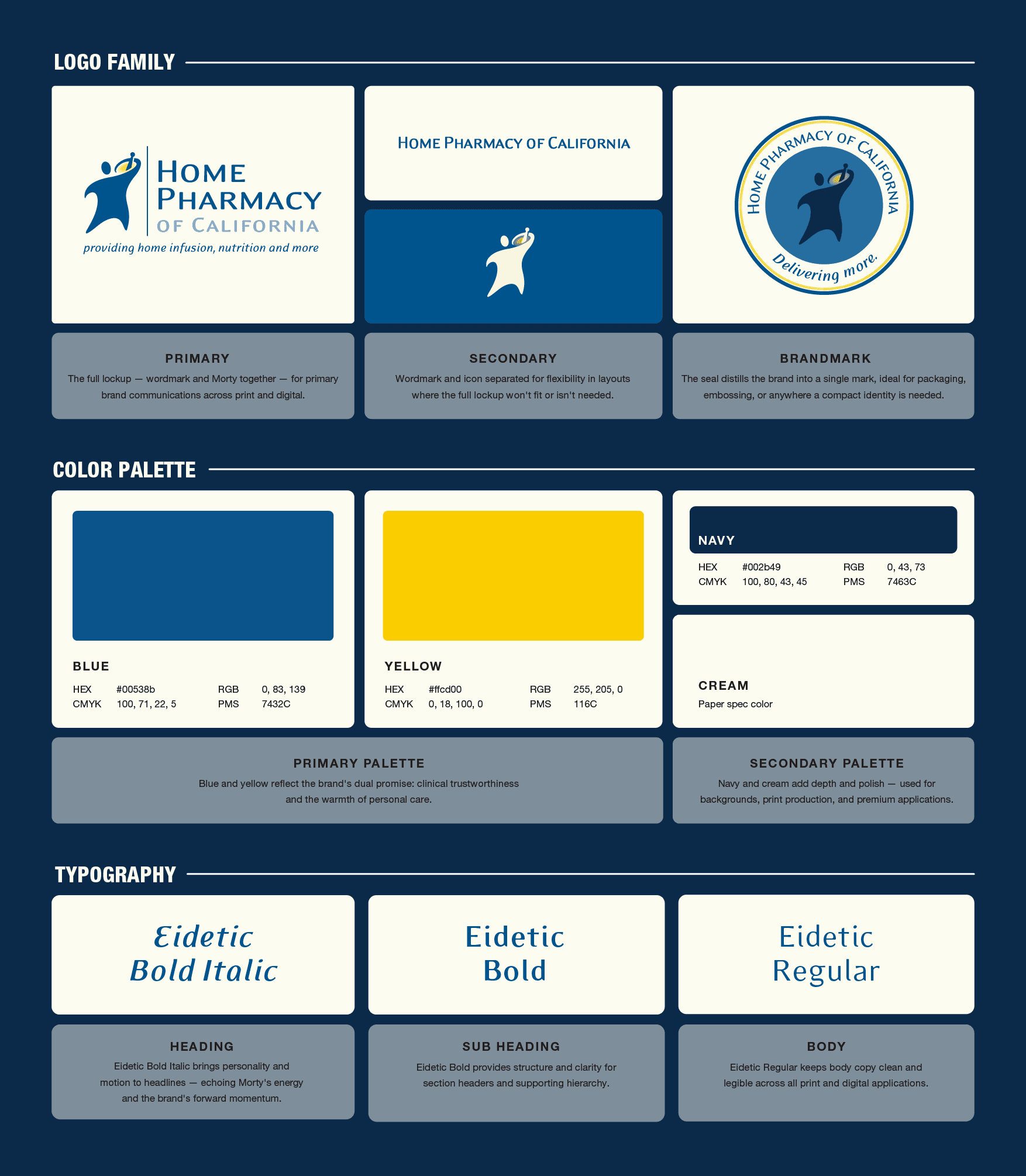
Their final choice, after much vacillation, was what we affectionately called, Morty the Mortor Man. He’s friendly, yet ‘on the move,’ coming to a patient’s door with a healing mixture from a pharmaceutical mortor. The overall clean and simple use of type combined with the friendly and bold logomark appealed to all of Home Pharmacy's target audiences and expressed the nature of what they do.
Impact: An effective rebrand can help raise the perception of value in the eyes of not only customers, but also lucrative investors. Home Pharmacy of California was bought out by Walgreens just a few years after this rebrand was completed.
Quick brand guideline reference


